5 questions about the Air Botswana rebrand
Air Botswana recently unveiled two brand-new ATR 72-600 aircraft. But what really caught my eye wasn’t the new planes—it was the logo. Subtly introduced, the airline had rebranded in celebration of its 30th anniversary… but did so remarkably quietly.
A rebrand for an organisation like Air Botswana is no small move. It’s a brand with a complex reputation—one people either tolerate or quietly resent. As a parastatal, many have long called for its privatisation. The airline is notorious for delays, infrequent routes, and prohibitively high fares. National carriers should inspire pride. Instead,
Air Botswana often evokes frustration, anger, and—regrettably—embarrassment.
There was a time when it flew to Johannesburg, Cape Town, Harare, and Windhoek. Now, only Johannesburg remains. After 30 years, one might wonder how the airline has survived at all—let alone afforded new planes… or a rebrand.
*At the time of this post being written, there are reports that suggest Air Botswana will be reintroducing flights to Cape Town.
Rebranding is never a trivial decision. It’s bold. It signals that change is coming—or at least, that it should be. Done right, it breathes life into a struggling brand. But it must be strategic, purposeful. That’s why Air Botswana’s rebrand is so intriguing. Most organisations rebrand to reposition in a competitive market. Air Botswana, however, has no real competition. It doesn’t need to carve out space; it needs to fix what’s already broken.
So, with that in mind, here are my five questions about Air Botswana’s rebrand. The extracts below were taken from an article in the ‘Wings of Service’ magazine regarding the rebrand.
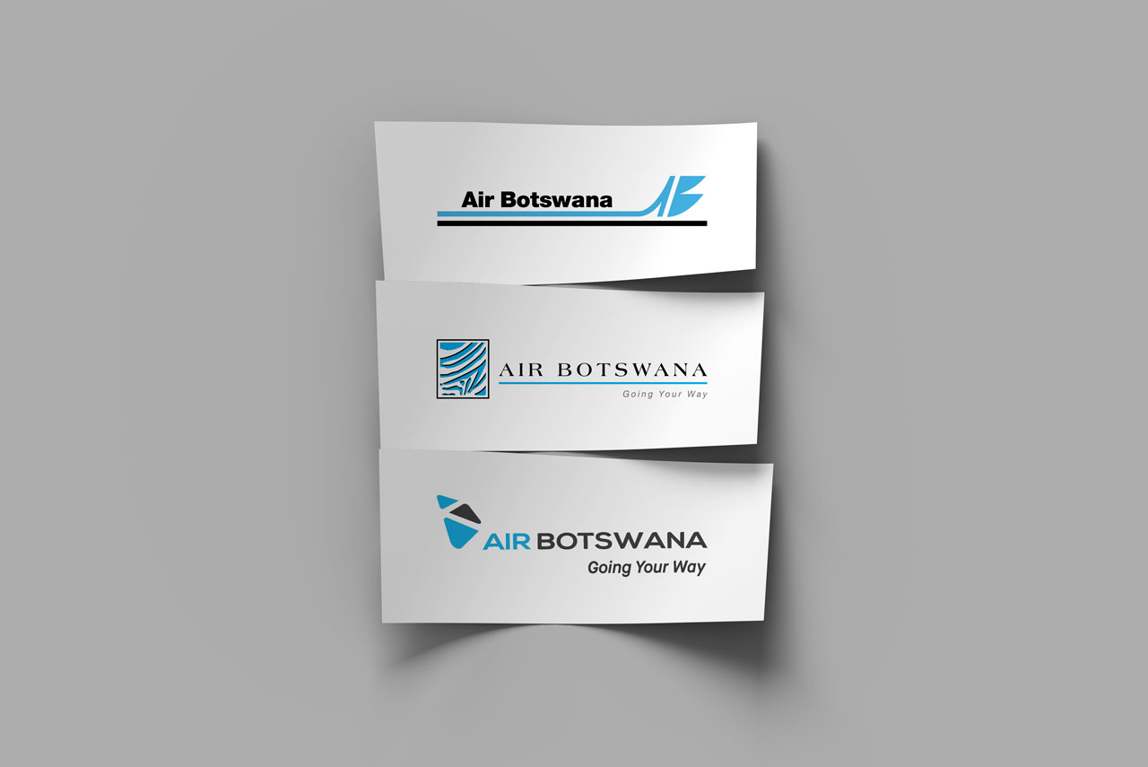
1. Why celebrate diamonds?
“…the design is inspired by Botswana’s diamonds, represented by the three shapes that make up the ‘tail’ of the logo…”
The rebrand commemorates 30 years of service. Yet, curiously, the new icon celebrates a commodity from an entirely different industry. Yes, diamonds are central to Botswana’s economy and have shaped its development. But the ease with which they’re integrated—again—shows a tendency to lean heavily on one sector at the expense of others.
Botswana also mines copper and coal. We have agriculture, cattle, and—crucially—tourism. In fact, tourism is arguably the country’s most recognisable global asset. The Brand Botswana logo captures this with warmth and optimism, using the sun as a central motif. By contrast, diamonds feel like a safe but uninspired choice.
Design-wise, the diamond shape works. It’s clean, flexible, and instantly recognisable. But it doesn’t say Air Botswana. It doesn’t say national airline. Symbolically, diamonds evoke luxury and perfection—two qualities Air Botswana has consistently failed to deliver. The customer experience is anything but premium, yet the ticket prices suggest otherwise.
A brand identity like this needed to feel grounded, honest, and forward-looking. Which leads me to my next question…
2. Was there an alternative to diamonds?
While the rebrand marks three decades of operation, branding is about the future. Botswana’s vision is to diversify beyond diamonds—a message echoed by leaders like Minister Kenewendo, who has championed the idea of a “people-centred” economy.
So why not a people-centred airline brand?
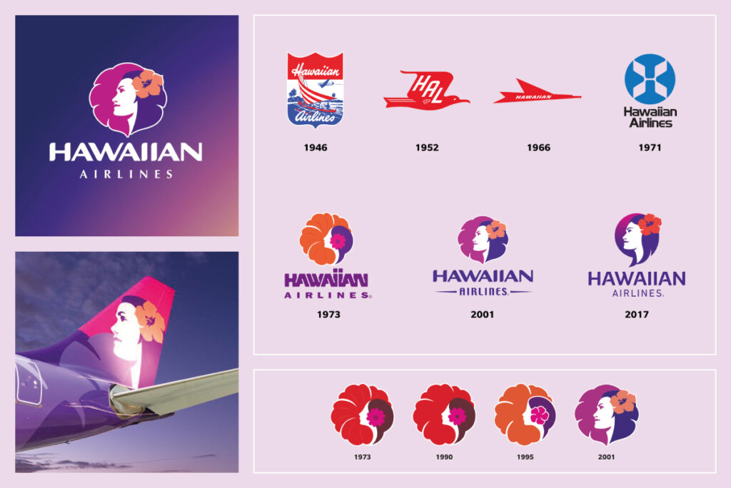
A great example is Hawaiian Airlines. Their rebrand focused on identity, culture, and people. It captured the spirit of the islands and connected with both locals and visitors. Air Botswana had the opportunity to do the same.
What if we had drawn inspiration from the Botswana basket?
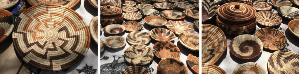
These intricately woven designs symbolise heritage, craftsmanship, and unity. They’re made by Batswana, from materials found in Botswana. A rebrand inspired by the basket could have been powerful—complex patterns signifying diversity, strength, and continuity. It’s an authentic symbol of homegrown excellence.
Air Botswana could have embraced it visually, served snacks in custom baskets, or even sold them onboard. It’s a missed opportunity to create emotional and cultural connection.
If the zebra print was no longer viable, the basket could have been a beautiful, equally versatile replacement. Which begs the question…
3. Why do away with the zebra print?
“If it ain’t broke, don’t fix it.” So—what was wrong with the zebra motif?
The zebra is Botswana’s national animal. It’s a symbol of unity and identity. The zebra print was distinctive and beautifully integrated into the aircraft livery. More importantly, it gave Air Botswana character. It was recognisably Botswana.
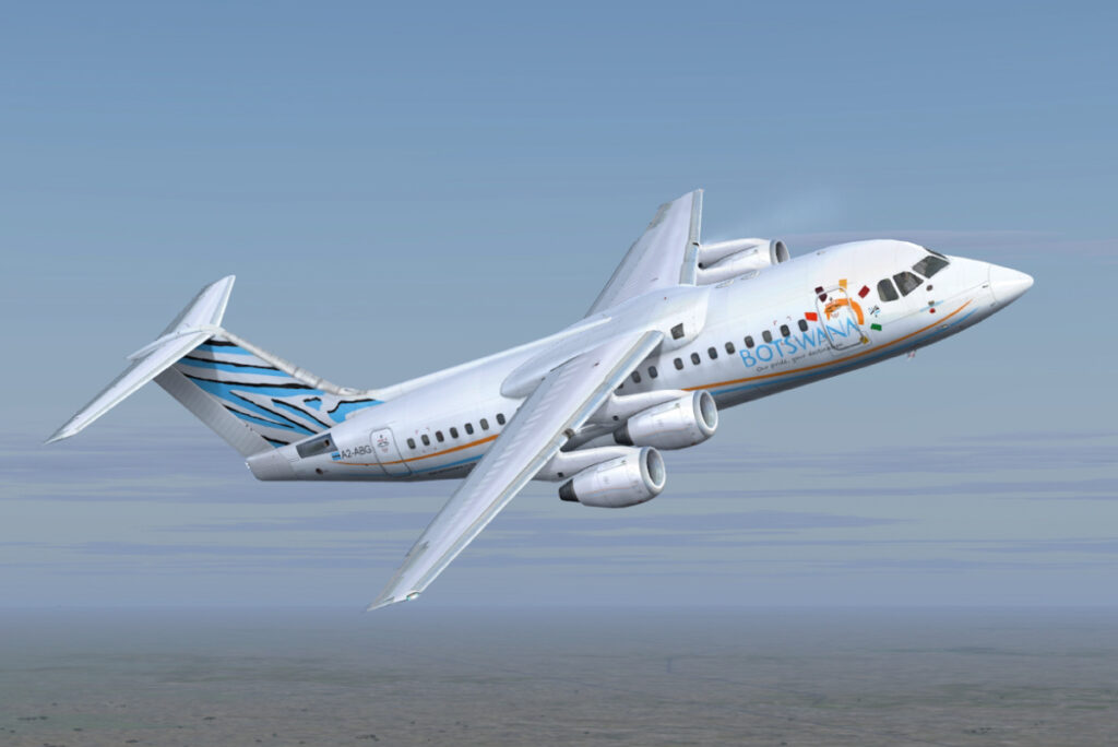
No other African national airline—at least none I’m aware of—uses this motif. In a crowded industry where brand differentiation is critical, the zebra was Air Botswana’s strongest visual asset. It evoked national pride and had instant recall.
Now, it’s gone. Stripped away.
Had the airline been in private hands, I doubt this element would’ve been discarded so easily.
4. Why place visual significance on southern Africa?
“…the three shapes are grouped to suggest the shape of southern Africa…”
This is a curious decision. If the largest shape represents the south, that places disproportionate focus on South Africa. And if the central shape—coloured black—represents Botswana, then what does the overall composition really suggest? That Air Botswana’s future lies in regional travel?
That’s fine—if that’s the strategy. But it feels limiting.
This is Air Botswana, not Air Southern Africa. A more obvious but still meaningful choice would have been to abstract the shape of Botswana itself. Most national airlines brand around their country. There’s a reason for that: it works.
This interpretation—however subtle—risks sending mixed messages about scale, focus, and aspiration.
And what if, in the next 30 years, Air Botswana expands further afield? Suddenly, this visual element becomes irrelevant—or worse, restrictive.
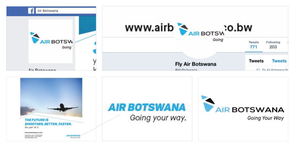
5. Why is there no consistency?
“Looked at closely, the complete logo evokes an aircraft in flight with an upward trajectory…”
An aircraft with an upward trajectory would, logically, be pointing… upward. This logo is horizontal. It’s a small detail, but it highlights a broader issue: visual coherence.
The tagline beneath the logo is oddly scaled. It competes with the main logo rather than complementing it. A more balanced approach—reducing the font, spacing it out, aligning it with ‘SWANA’ or ‘WANA’—would have created visual harmony.
Worse still is the lack of consistency across platforms. A visit to Air Botswana’s social media pages shows a logo that struggles with visibility. Long, horizontal logos don’t translate well to square profile pictures. This is Branding 101. A professional agency would have provided logo variations for different formats.
Even the typeface used for the names of the aircraft—‘Tsodilo’ and ‘Okavango’—doesn’t match the logo. These may seem like small issues, but together they paint a picture of a brand struggling with its own identity.
So… Was the Rebrand Worth It?
I take no pleasure in saying this—but based on what we’ve seen so far, the rebrand does not inspire confidence. The logo may be new, but the issues remain painfully familiar: delayed flights, limited routes, and high prices.
A rebrand without operational change is just a new coat of paint over old cracks.
In truth, Air Botswana didn’t need a dramatic overhaul. It needed a refresh—something modern, yes, but rooted in its original identity. The zebra motif could have been refined. The typography updated. The colour palette adjusted. Small, strategic changes that respected the legacy and built for the future.
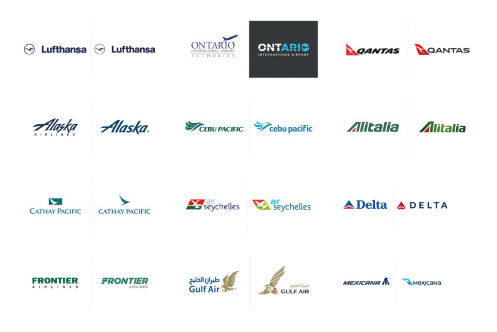
Take a look at other airlines that have done just that—updating their look without losing their soul.
Ultimately, the solution to Air Botswana’s problems has always been clear: get more people flying, more often. That starts with affordability and reliability—not aesthetics.
Until the airline addresses its core challenges, the new logo will feel like a distraction. A rebrand should reflect transformation—not mask stagnation.
Comments
Temba
December 20, 2018 at 6:46 amSuch a well written post and fair points made. It made me think differently about branding and I also think they should have kept the zebra print.
Ranallo
December 26, 2018 at 1:30 pmYou are a very bright individual!
Nasim
January 10, 2019 at 1:17 pmThanks for this post.
Mokoko Gaboutloeloe
January 10, 2019 at 3:50 pmYour article is very insightful and with a lot of recommendations and food for thought. It’s a genuinely interesting read and a flattering interest in the airline.
The insightful essence of the lessons is certainly thought provoking. It’s interesting to note that the thought processes similar to most of your points were considered. In the end the decision rested on this design but thought was certainly expended and a decision making test group was involved.
The only assurance I can say is that the decision was not taken lightly. You will be pleased to note that we are undertaking a strategy review to be in alignment with the fleet modernisation project. Though we will fall short of the recommendations they are noted and some have been considered whereas some are being implemented.
Thank you for the insights and comments. We certainly appreciate your ‘ownership’ and interest in our Airline. We provide our assurances that we will strive to meet your expectations
Verona
January 15, 2019 at 9:27 amThanks for a marvelous post! I definitely enjoyed reading it, you are a great author. I want to encourage you to continue your great posts.
Zoucha
February 20, 2019 at 7:20 pmThank you for wonderful post. Where else may anybody get this type of info in such an ideal means of writing? I have a presentation next week, and I search for such information. Thank you.
Selene
February 25, 2019 at 5:51 pmI’m still learning from you, while I’m trying to achieve my goals. I absolutely liked reading all that is written on your website. Keep the posts coming. I like it!
Zach
March 23, 2019 at 10:22 amAt last I found a blog from where I can truly take useful info concerning my studies.
Gorham
April 5, 2019 at 4:47 pmWonderful site. Lots of helpful info here. I’m sending links to several pals. Thank you to your efforts!
Dann
April 29, 2019 at 12:02 pmAmazing analysis!
Syree
June 9, 2019 at 6:59 pmNice post. I learn something totally new and challenging on sites I stumble upon on a daily basis.
Robbin
June 15, 2019 at 12:01 pmMy friend! I want to say that this post is awesome, great written and include almost all important infos. I’d like to see more posts like this .
Margart
July 4, 2019 at 6:36 pmJust wish to say your article is outstanding. The way you put your views across are so simple to understand and shows you are a professional on this subject. Air Botswana should have done some research and engaged you. Thanks a million and please carry on with the gratifying work.
Sedireng
November 29, 2019 at 1:18 pmHindsight is a wonderful thing, maybe if Air Botswana had seen this article before they rebranded they wouldn’t be in the mess they are now.