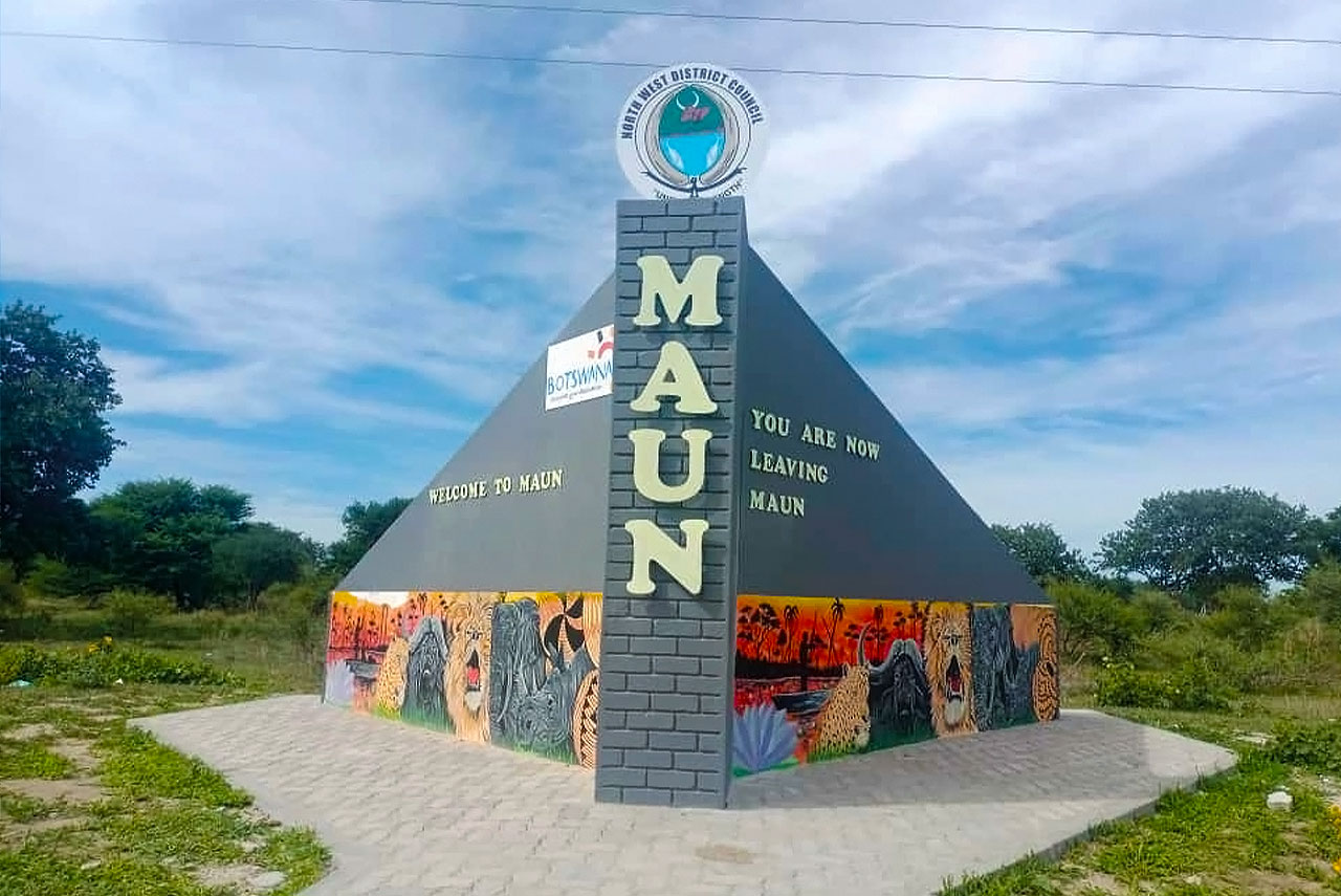
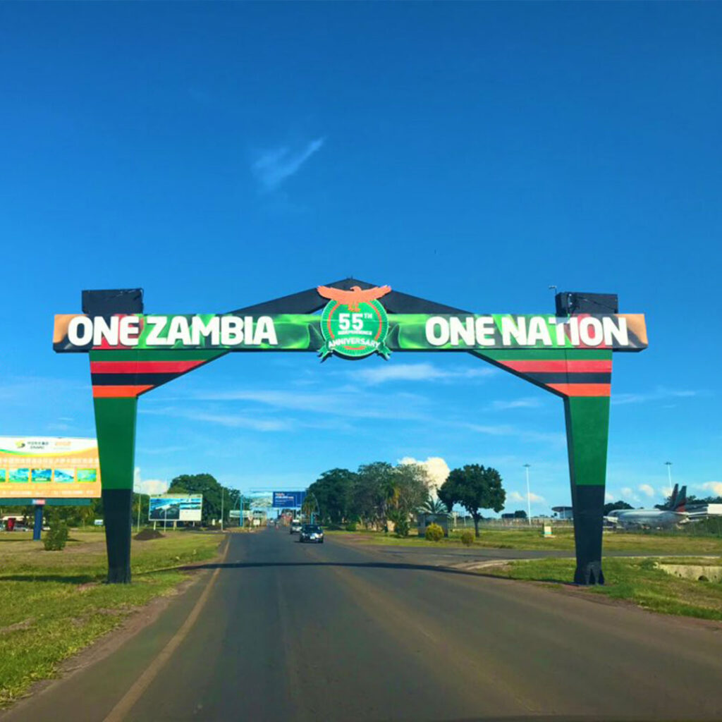
The Maun Gateway Structure
In December 2022, the North West District Council officially launched a roadside structure, which acts as a gateway (of sorts) to Maun. The names of the people responsible for making the structure have been published within the public domain, but I will refrain from identifying them in this article. This is a critical review based on my opinions, it’s not in any way personal, my objective is not to ‘name and shame’ or tarnish their reputations.
Maun – a place close to my heart
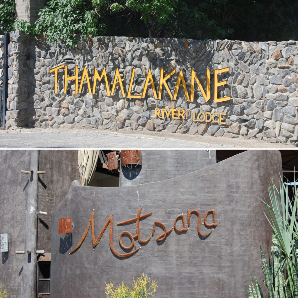
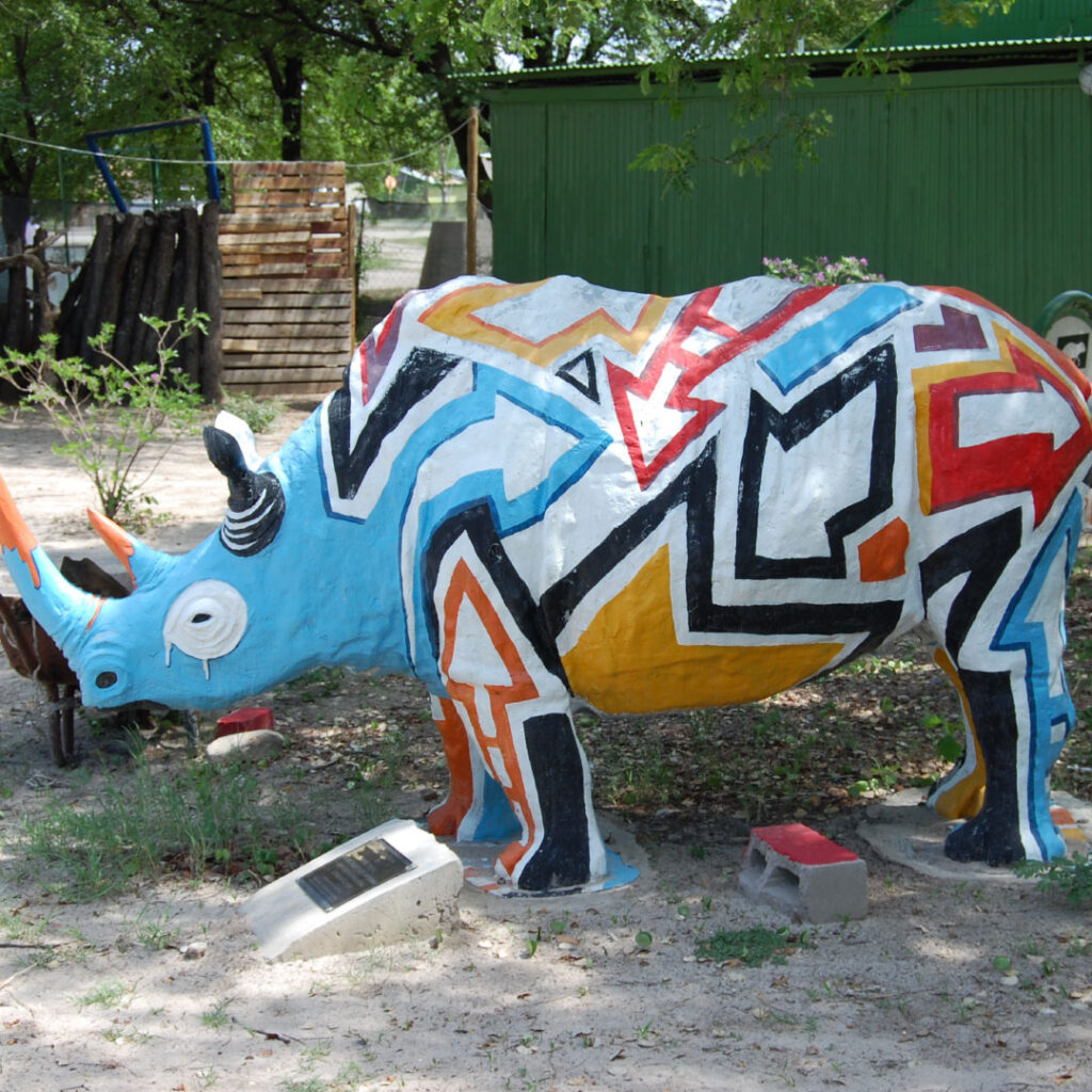
First things first, Maun is my spiritual home and this is, in part, because my wife is from Maun, but also because Maun has a very special place in my heart. When I first visited Botswana, I spent most of my time in Maun, and it was a life-changing experience. I live in Gaborone and for me, going to Maun is like going to a different country. Not only is the landscape different, but I feel the people and the general vibe are different. Creativity in Maun is immense and plays a large part in the Maun brand, and the standards are high. Which is why I’m struggling to look at this gateway structure and feel it adequately represents Maun, or at least the Maun I know and love.
Don’t get me wrong, I am 100% behind the council’s initiative and their intentions. Any effort made towards developing Maun (and other areas of Botswana) gets a round of applause and a thumbs up from me. But, when I first saw a picture of the structure, I just assumed it was something that had been built by children for a school project. I’m not saying that to be funny or offensive, that was truly my first impression – I was shocked when I discovered what it actually is.
Sometimes the more you look at something, it can start to grow on you, but the more I look at this structure, the more of an eyesore it becomes. I don’t know the exact brief, the budget or the timeframe, but given the nature of my profession, I’ve spotted elements that ramp up my OCD and leave me wondering – what where they thinking? Admittedly, creativity, art and design can be very subjective, you’ll never please everyone. But in reference to this structure, simply applying design basics could have made a vast improvement.
The Maun Gateway – an analysis
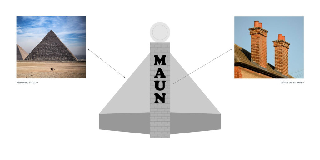
Looking at it face-on, I see a chimney-like structure built onto to a pyramid-like structure. It’s obviously not a chimney, but why make the side walls smooth and apply a brick effect to the front part? That’s what makes it look like a chimney. What is the reason for the selective brick effect? It’s obviously not a pyramid, but why incorporate this shape anyway? A pyramid makes you think of Egypt long before it makes you think of Maun.
Unlike most of the other topics I’ve written about, I wanted to know what other people thought. In order to garner other opinions, I created a post on LinkedIn, and I’ve since read a few similar posts on other platforms. Quite a few people have made comparisons to the ‘Welcome to Swakopmund’ structure in Namibia. You can’t deny the resemblance is uncanny, and it may well be a coincidence or it may have been the inspiration. I have tried to source more information on the Swakopmund structure, but haven’t received a response. I’m going to assume it was built in the early 1900s and could be at least 80-100 years old, if not older.
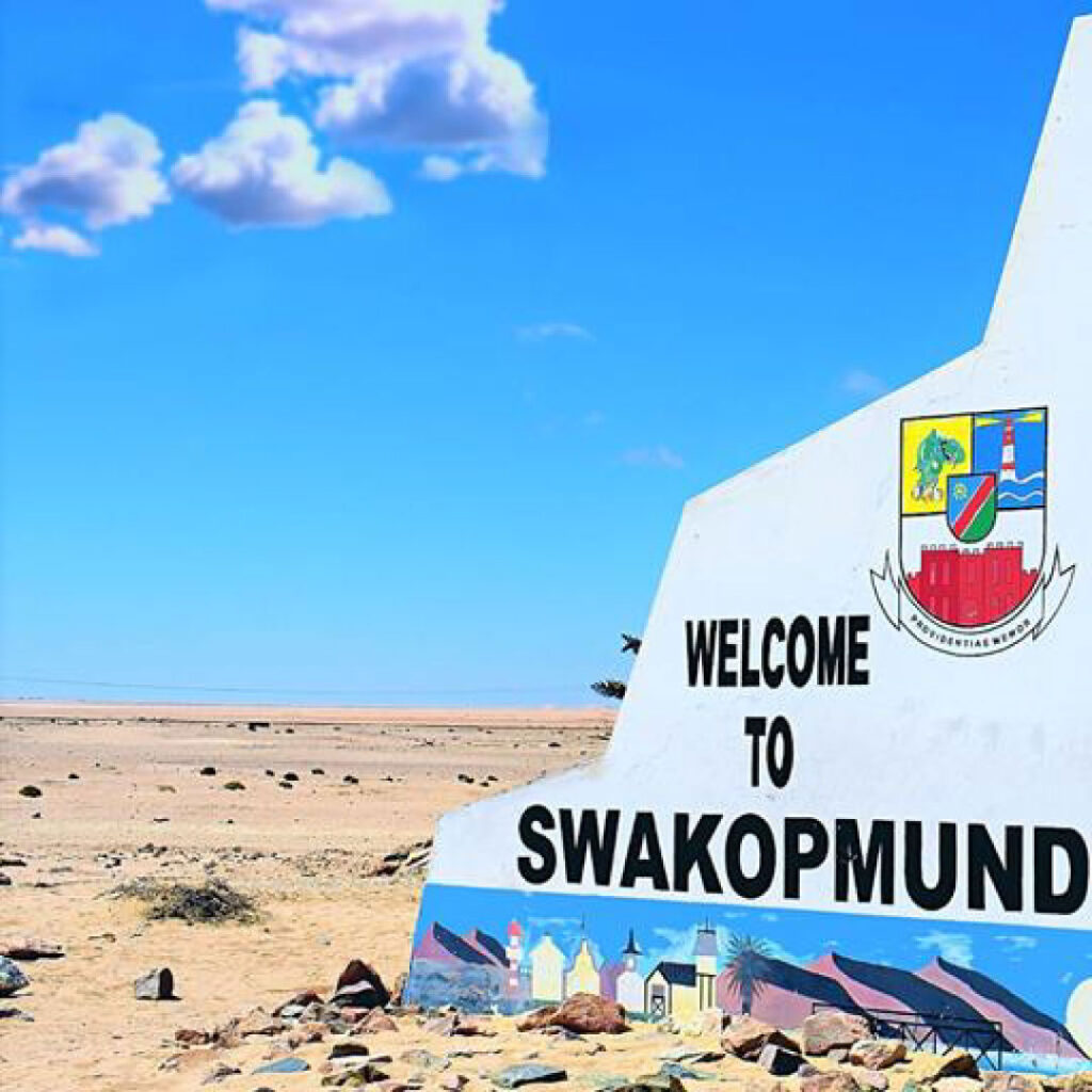
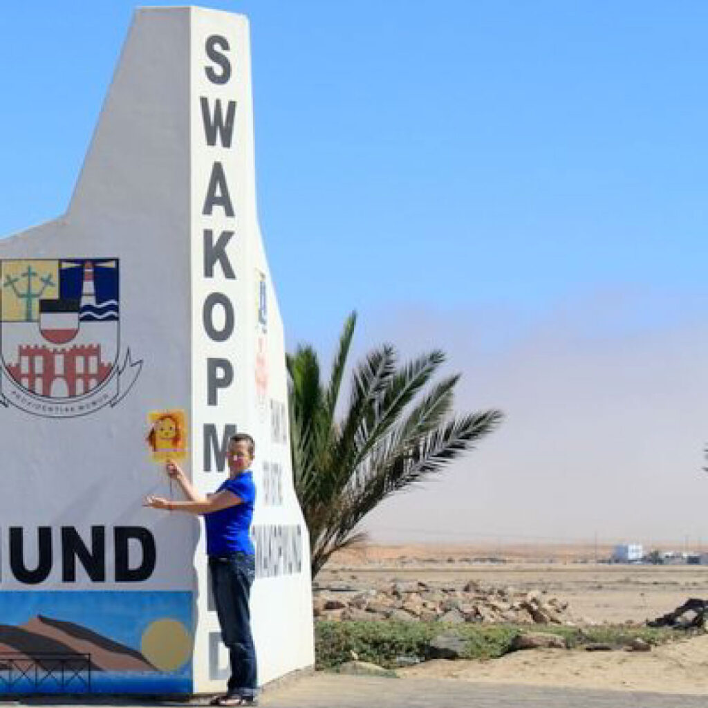
The thing about some age-old structures is they can look simple, almost immature (by today’s standards), but it’s difficult to be overly critical since they didn’t have the same technology or machinery we have today. They didn’t have much exposure to the wider world or the internet, and so, there was little in the way of inspiration. At the time, this would have been seen as innovative and functional. It’s now part of Swakopmund’s heritage and has become a feature. It is in-keeping with its environment, certainly mirrors older architecture in that area and blends in nicely with the sandy landscape that surrounds it.
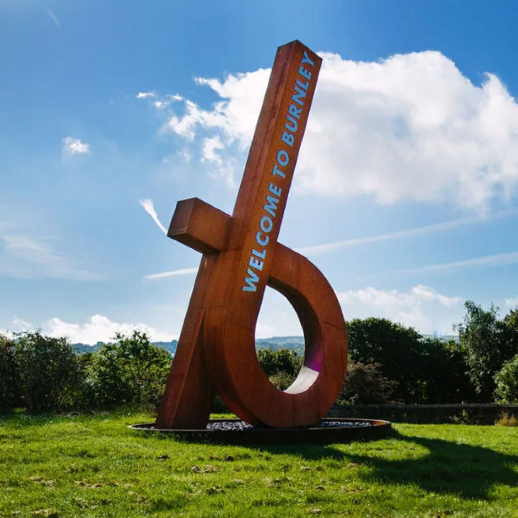
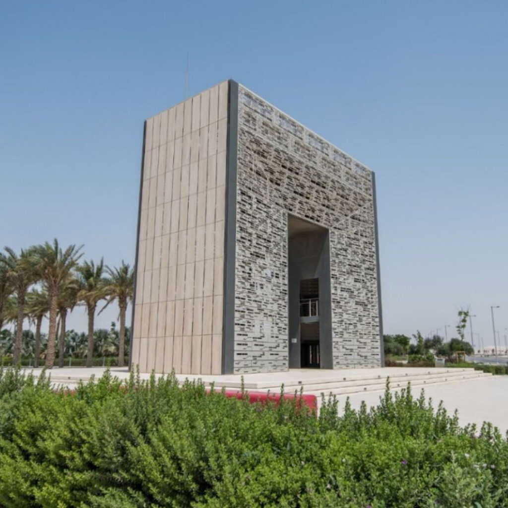
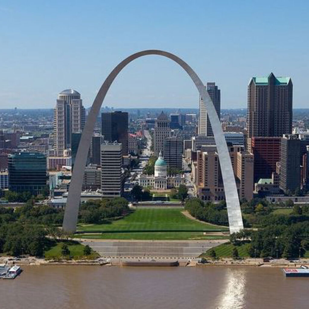
The Maun structure was built in 2022, technology has advanced and we have access to the world-wide web. Yet it is not an improvement on a structure built 80-100 years ago. When compared to other similar types of roadside structures in other parts of the world, hopefully, you will see why I feel the Maun gateway falls short.
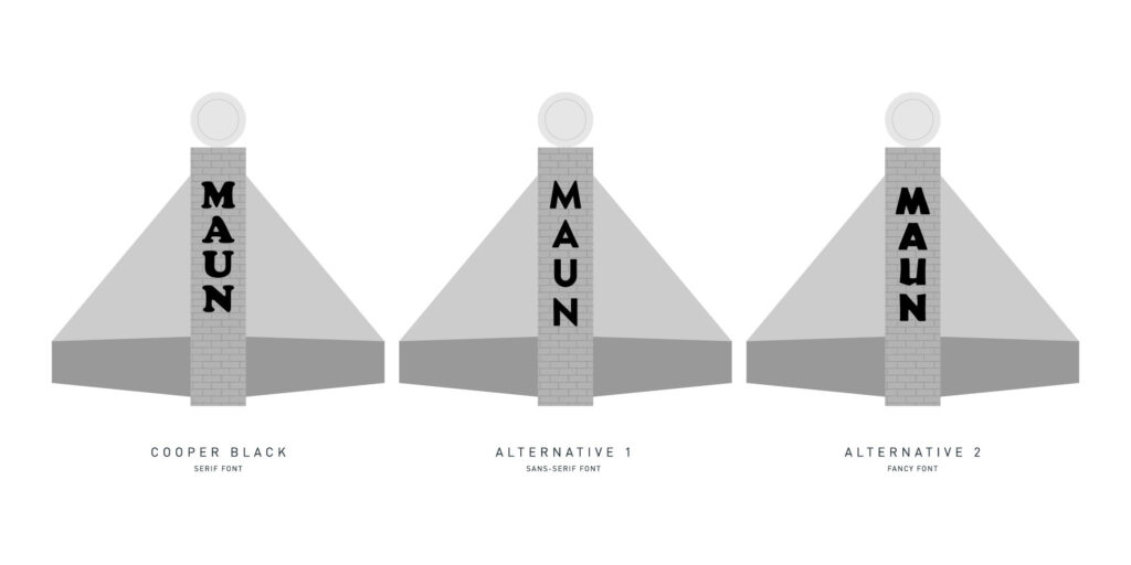
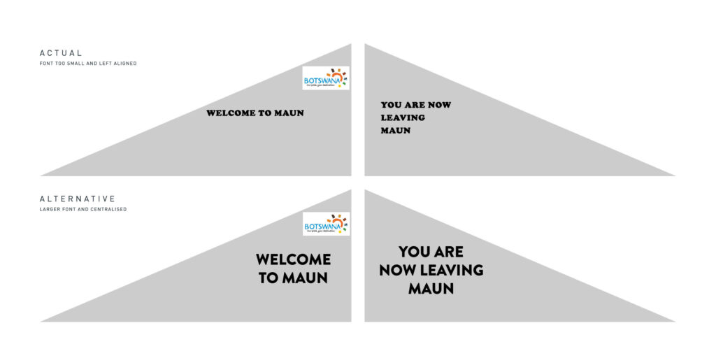
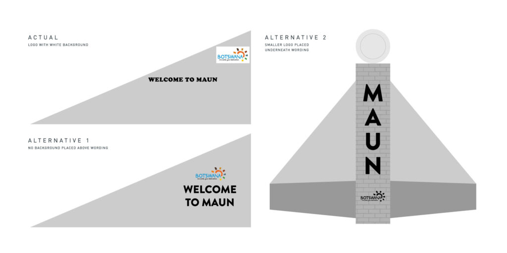
It’s a fairly large structure and so it’s surprising to see there’s a lot of empty space. One of the elements that slaps you in the face is that choice of font! Cooper Black font… really!? I’m not bothered they chose a font that’s a hundred years old, but they chose a font that has rounded serifs. This makes the wording look comical and yet they built a very rigid and serious structure with straight lines and painted grey. It’s a bizarre choice of font for this structure or any structure for that matter. You’d struggle to find any examples of structures that have incorporated Cooper Black on the exterior.
Then I wonder with all that space on the sides, why is the font so small? Can the words be read by people in passing cars? Why did they align the text to the left and not centralise it? Why not keep the word ‘Maun’ on the same line as ‘leaving’ – there’s more than enough space? Why is the exact same artwork on both sides? Why duplicate it and not paint two different artworks? Why paint it grey? Why is the NWDC logo slightly lopsided.
Why place the Brand Botswana logo there? Why use it at all? The Brand Botswana logo is one of the most overused and misused logos in Botswana. But why use a sign with a white background? Could a Brand Botswana sign without a background not have been made, like they did with the lettering?
It’s such a shame. When all the elements come together, none of them makes sense, they don’t compliment each other. I don’t see any real artistry or love or passion in this structure, it looks as though it was made in a hurry and constructed by committee. I can’t stress enough the high level of creativity in Maun and I can’t understand why none of it has been incorporated into this structure.
Inspiration is all around us
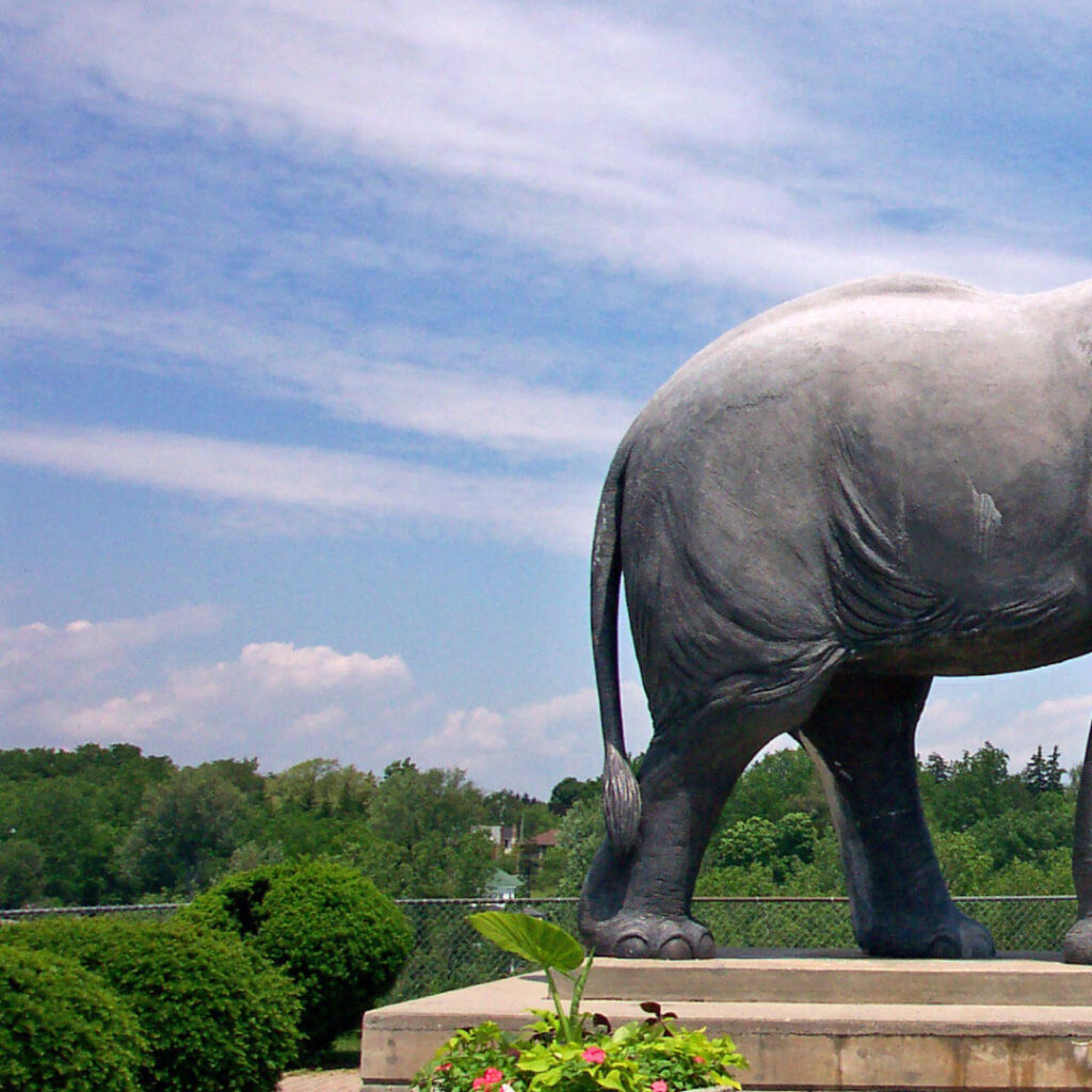
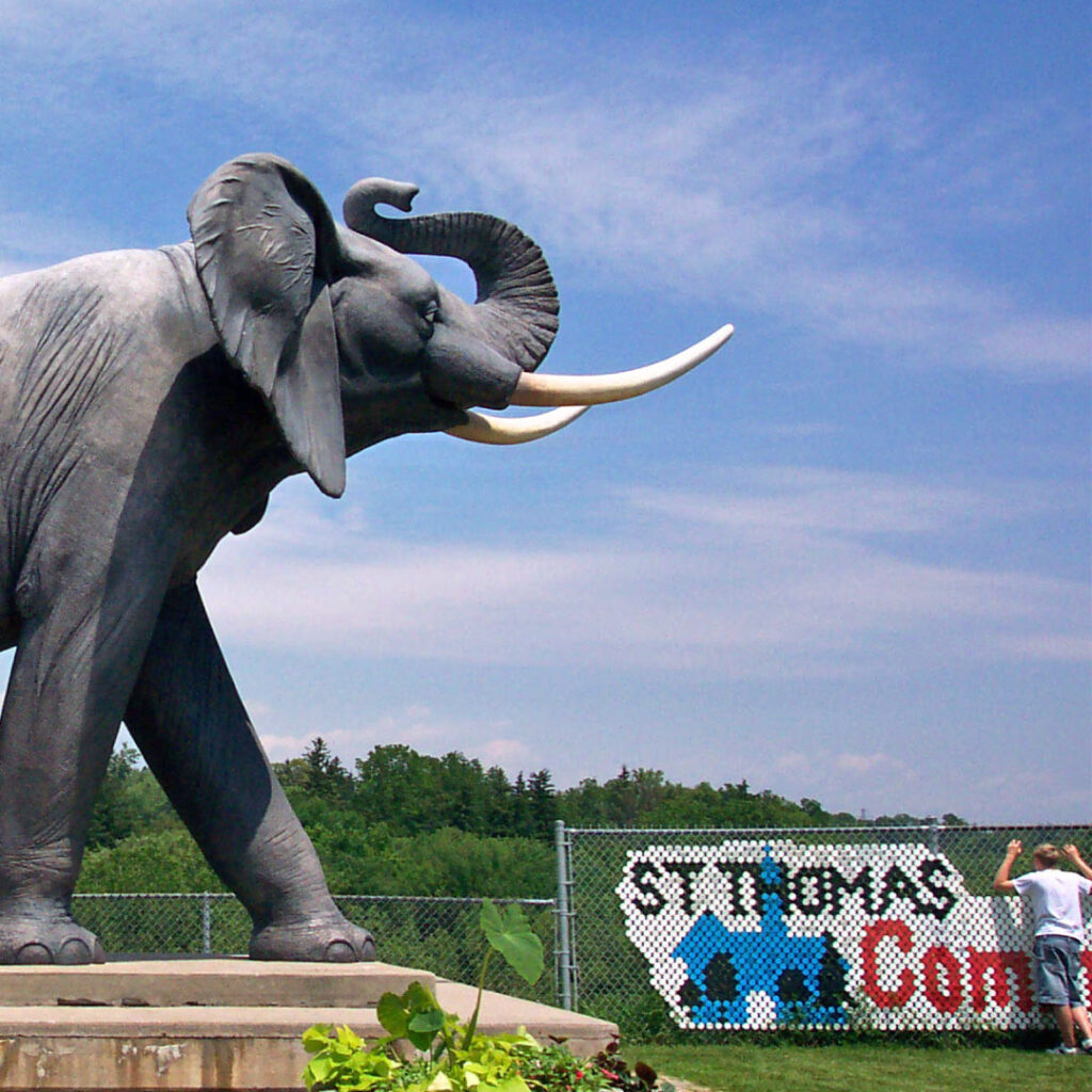
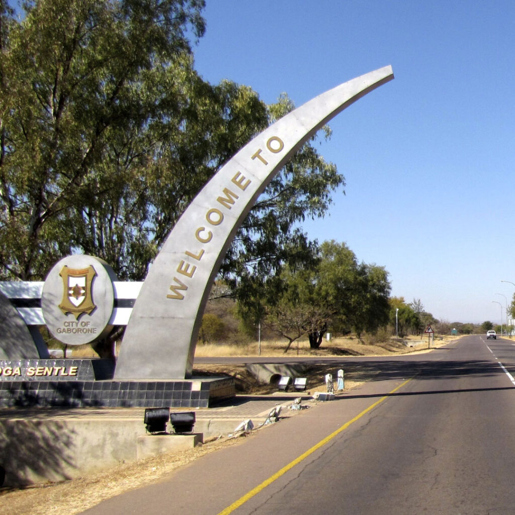
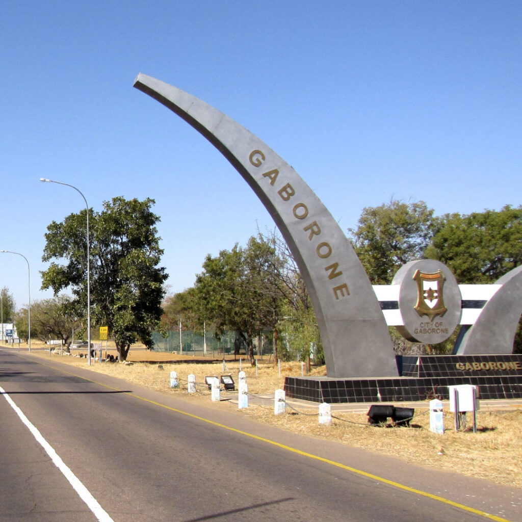
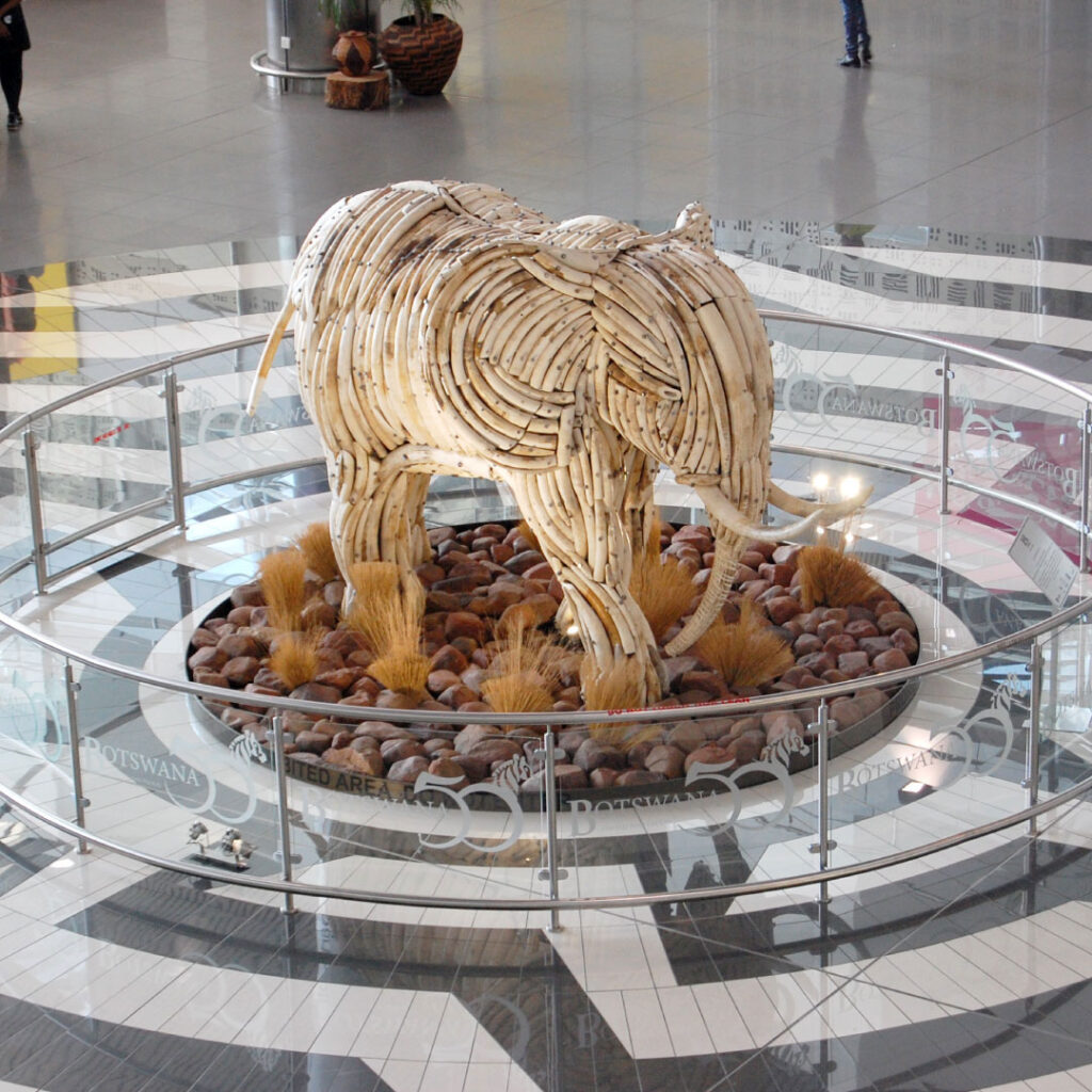
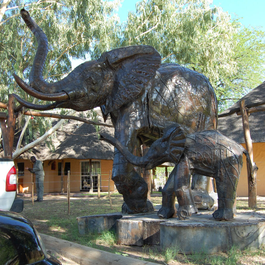
If we look for alternative approaches, there’s inspiration in Gaborone. When you arrive at SKK Airport you are greeted by a brilliant sculpture of an elephant made from ivory. When you leave the airport, you drive past two large metallic tusks, welcoming you to Gaborone. Another concept that could have been implemented is inspired by totems. Each tribe and area of Botswana has a totem, Maun’s is the kudu. This concept is something that could be replicated across the country.
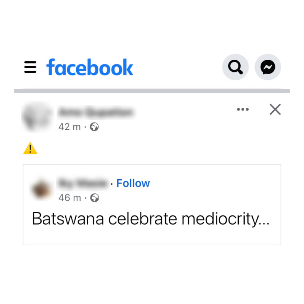
The overall feedback on social media has been positive, but I don’t always trust social media as a true gauge, especially Facebook. People will celebrate things for a variety of reasons, none of which are directly in relation to the topic. People will celebrate it simply because it was made in Maun, or it was made by someone they know. Some folk won’t be critical because they don’t want to be seen as negative or fear online retribution and mob mentality. The image below is a post I saw on Facebook, not my words, but it is a statement I’ve seen posted by Batswana many times.
Summary
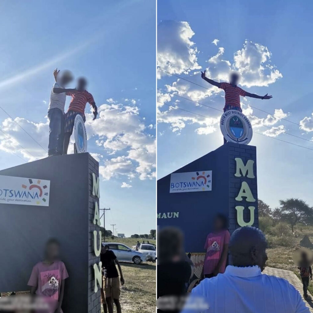
Going forward, I worry about the future of this structure. Whether I like it or not, it is what it is and it’s not going to change. But I find it deeply saddening to see images of people climbing onto the structure. At the time of writing this article, the structure is only 2-3 weeks old and already people are disrespecting it, treating like something you’d find in a children’s playground. Given its location, it’s already at risk of being destroyed by drunk drivers and speed freaks. How long will it be before we see vandalism or graffiti? How long before the council’s sign is bent or repositioned or removed altogether? How long before letters go missing or stolen? It shouldn’t have to be guarded, but maybe the council needs to think about protecting the structure.
If you asked me what comes to mind when I think about Maun, I think of nature, the environment, wildlife, safaris, wooden structures and water. Maun is organic, its fresh, it’s bright, colourful and has character. This is why I look at this structure with disappointment because it doesn’t evoke any of those associations and lacks character. This initiative had the potential to yield something rather special and yet this structure is average at best and could have been so much better. Maun is a large gem in Botswana’s crown, the place is remarkable and in no way average.
Maun deserved better.
What the people say…
Below are some of the comments made by those who responded to my post.
Positives
- It’s a good thing.
- Beautiful, very nice.
- Simply beautiful.
- It’s great, Maun needs to be branded.
- I like it, it’s pleasing to the eye.
- An effort it is and the artwork is awesome.
- It communicates the tourism hub that is Maun/Ngami
- This is beautiful.
- I love the animal paintings.
- It captures what Maun is.
- Kudos to the team.
- Thumbs up to Maun Admin Authority.
Indifferent
- How does it look at night?
- What ever improves or rebrands the Maun 10km spot is acceptable for me.
- Just okay.
- Just happy to see Maun branded, that’s all.
- I think I like it, but there is always room for improvement.
Negatives
- The Botswana tourism logo should have gone below the word MAUN.
- A lot could have been done differently to get the best out of the purpose.
- Not a big fan of the font.
- The grey brick has ALL the space!
- As for the creativity and originality, I can’t say I am happy about it.
- That North West District Council logo at the top was not necessary.
- Not feeling the font.
- Looks eerily similar to this [Swakopmund gateway], so creativity in question here.
- So much more can still be done.
- For the great place Maun is, tourism wise and people wise, the structure as a whole does not capture any of that.
- The tourism logo is not tying up with anything there, it feels like it was an after thought.
- The first time I saw this I thought Swakopmund.
- It feels like a copy and paste.
- Creativity was lacking a bit.
- We could have done something that would only remind us of Botswana.
- The design is too basic for me.
- It doesn’t stand out as a structure and tourist attraction site.
- The pillar has been copied from next door [Swakopmund].
- Lacks creativity.
- Not a nice view – mixed feelings.
- I thought it was a kids’ park.
- A junior school art project.