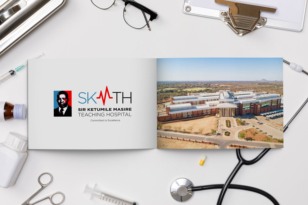
10 questions about the Sir Ketumile Masire Teaching Hospital branding exercise
Despite a global pandemic, the newly built University of Botswana Teaching Hospital has managed to carry out a branding exercise. Construction on the hospital started in 2010, with a view to it being officially opened in 2019. It was later renamed Sir Ketumile Masire Teaching Hospital (SKMTH) in honour of the former President after he passed away in 2017 — a recognition of his immense and immeasurable contribution to the country’s development. Rre Masire was also the University’s Chancellor from 1980 to 1998, and reappointed again in 2008 until his passing.
The hospital decided to source its new identity via a competition. The winning design was revealed in August 2020 — and was met with a wave of public criticism. Sadly, this isn’t the University’s first experience with a controversial branding exercise: several years ago, a rebrand of the University’s crest was also heavily criticised, leading to the reinstatement of the original design. Batswana feel a deep sense of ownership towards the University, and an even deeper reverence for their former President — did those involved learn nothing from past mistakes?
While I am not impressed with the winning design, I cannot hold the creator responsible. As a result of the backlash, the designer has been subject to ridicule and trial by social media. But he did nothing wrong. He simply entered a competition, his design was chosen, and he won P20,000 (approx. US$1,700 / £1,300). Whatever has happened since is on those who oversaw the competition and the branding exercise — not the entrant.
So here are ten questions I would like to ask.
1. Why source the logo via a competition?
I have previously written about the pitfalls of sourcing logos through competitions. My stance remains clear: these contests rarely produce desirable results. They are open to all — professionals, amateurs, opportunists, and even children — meaning the quality of submissions can be highly variable. Most serious designers and agencies do not enter such competitions.
President Masire is an iconic figure, deeply respected by the nation. To trivialise the branding of a hospital named after him by means of a competition is baffling.
Furthermore, it’s important to understand the audience. Branding requires deep research and reflection. Yet internet access in Botswana is expensive and limited; many cannot afford stable connections, and conducting robust research via mobile devices is impractical. This environment limits the variety and depth of submitted ideas — likely resulting in repetitive, literal designs.
Even if a masterpiece had emerged, would those on the selection committee have recognised it? Without professional guidance, I doubt it.
Botswana is under global scrutiny on various fronts — including environmental issues like the elephants controversy. Branding contributes to the nation’s perception abroad. We must look credible, and like it or not, branding is a major part of that. To outsiders, a country’s institutions will be judged by their public image.
2. Why not put the final decision to a public vote?
Transparency is critical in any competition. Why were the finalists not publicly displayed and put to a vote? Even if the committee wished to guide the final decision internally, public input could have provided valuable feedback.
Keeping everything behind closed doors invites accusations of fixing and undermines trust — not ideal when building a new brand that needs to inspire confidence.
3. Is the winning logo in breach of copyright?
Many claim the logo infringes on the style of Shepard Fairey’s famous Barack Obama “Hope” poster. The visual similarities are undeniable.
While the technique is not protected by copyright (and has been widely parodied), the style is so closely tied to Obama’s 2008 campaign that it feels culturally inappropriate to use it here. It’s not just a technical issue — it’s a branding issue.
The SKMTH logo is not flattering. His Excellency’s likeness appears distorted, and it simply doesn’t do justice to his memory.
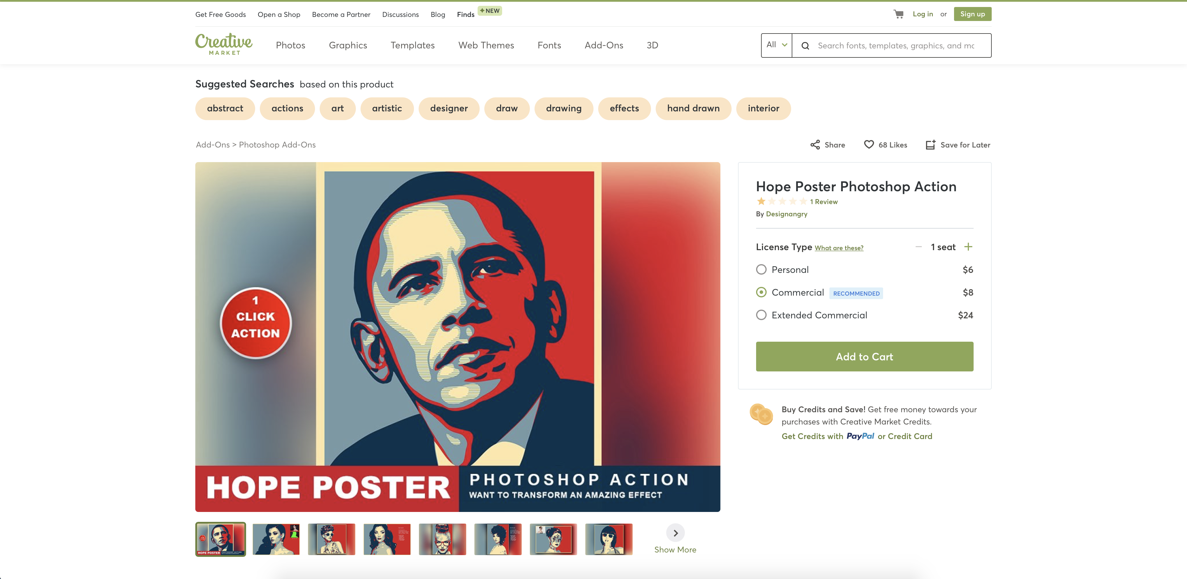
Using a style so heavily associated with an American president, rather than something rooted in African or local imagery, feels misplaced. The Obama poster symbolised “hope” and “change” — concepts powerful in their context, but not directly relevant to Sir Ketumile Masire or this institution.
4. Are there subsequent branding issues?
Good branding requires technical forethought. Was the winning logo submitted in scalable vector format, or just a high-resolution JPEG? Is there a brand manual outlining use cases, colour palettes, and typography standards? Without one, future materials like letterheads, business cards, signage, and uniforms are at risk of inconsistency.
This is not just about aesthetics — it affects the hospital’s professional image long-term.
5. Can the logo work without the picture?
Some suggest removing the illustration and keeping just the text. I disagree.
The typography alone lacks warmth, friendliness, and character — qualities vital for a hospital brand. The font, Montserrat, is modern but not necessarily suited for healthcare.
This was an opportunity to create a vibrant, contemporary, Afrocentric identity — something more reflective of President Masire’s visionary spirit. Instead, the result feels generic and impersonal.
A creative alternative could have been to adopt an acronym — e.g., Masire Teaching Hospital (MTH) — in the same spirit as Gaborone Private Hospital (GPH).
6. Why was a professional and/or experienced individual not involved with this exercise?
It appears no experienced creative professional was involved in the selection process. If one was, it would be deeply concerning.
Most likely, the committee was composed of medical practitioners, academics, marketing, and PR personnel — not designers. Without creative expertise at the table, the outcome was sadly predictable.
7. Was this exercise really a priority?
In the midst of a global pandemic — with SKMTH housing Botswana’s confirmed COVID-19 cases — was this branding exercise truly necessary at this time?
A more strategic move would have been to delay branding until life returned to some semblance of normalcy. A proper unveiling event involving past and present Presidents, the Minister of Health, and the Masire family would have been far more fitting than a quiet social media post.
8. Did the hospital need a logo?
Was a new logo essential? The hospital is part of the University of Botswana, which already has a strong visual identity. Simply adapting the existing university crest could have sufficed, at least temporarily.
Later, a statue or sculpture of Sir Ketumile Masire near the hospital entrance could have provided a lasting tribute.
9. Why not consult the Masire family?
Perhaps the most glaring oversight: the Masire family seems not to have been consulted.
This is unthinkable. Who knows the man better than his own family and friends? Incorporating their insights could have led to a far more personal, meaningful tribute.
In the UK, I once worked with a catering company whose logo incorporated a flower — the founder’s late wife’s favourite. Small, personal touches like these make a brand genuine and memorable.
Back in the UK, I used to work for a contract catering company whose logo featured a flower. It seems bizarre to use a flower in the brand for a catering firm, but it was a dedication to the original founder’s wife. I forget the name of the flower, but he wanted it incorporated because it was his wife’s favourite flower. He personalised the brand and this could have been the case with the hospital… had his family been consulted.
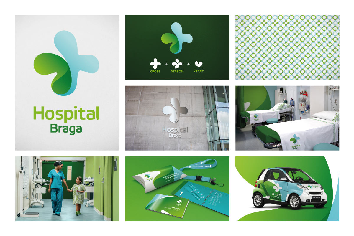
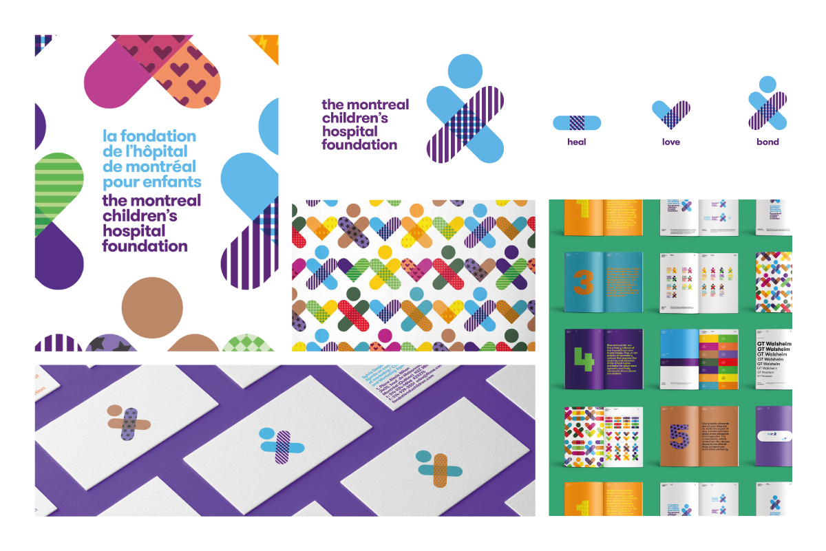
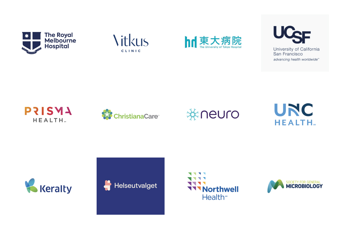
10. Are there other options?
Of course. Other hospitals around the world have demonstrated varied, thoughtful approaches to branding.

In conclusion:
While logo competitions can sometimes be a necessity for small businesses with limited budgets, major institutions — especially those bearing the names of national heroes — have a responsibility to invest properly in their public image.
Competitions like this harm the creative industry, breed mediocrity, and diminish the professionalism we should be promoting.
Imagine this: you are a surgeon applying to the prestigious Sir Ketumile Masire Teaching Hospital. Instead of submitting your CV and credentials, you are asked to send a video of yourself performing surgery — and the “best-looking” video wins the job.
Would you trust that hospital?
Branding is surgery too — it demands precision, professionalism, and above all, respect.
Comments
O’Brien Kutlwano Gopolang
August 18, 2020 at 7:33 pmAs expected you pointed out a few very important points. I really appreciate some of the insights especially those that cover the fundamentals of branding. In my opinion, in Botswana we are always caught up in creating the next big brand icon right next to Coke (which is not wrong) but always fail to focus on the sentimental value of what we are faced with creating. SKMTH was an okay acronym in my opinion but I fear we were so caught up in trying to depict the Hospital and H.E in one image and forgot why we honoured him in the first place. I personally would have advised against the branding to start off with especially in what I see as a rushed process. With all that is going on we just needed to focus on building the teaching hospital by the values he lived by and only then maybe based on the reputation and culture surrounding the institute only then may we consider rebranding in that instance. Look at Sir Seretse Khama International Airport, not that it needs it, but it still has great potential and such an open option ready to go when the time ever comes and I pray when the time comes it becomes such a smooth transition.
Hilda
August 24, 2020 at 10:16 amIch habe hier einige ausgezeichnete sachen gelesen. So hervorragende informative website.
Henry
August 24, 2020 at 6:37 pmExcellent article. I hate these competitions, they are not helping the industry.
Elté
September 27, 2020 at 7:28 amAll the points reissued here and the way you have gone about to tackle them – ON POINT. Thank you for publishing such an informative article. I really do hope someone from the hospital and those that took part in the competition do have a read. I still believe this needs to be rectified; it really doesn’t pay much respect to our former President, well, not in the manner they had probably wished for it to. One of my biggest problems was that the style of design, which is very much recognized to be the Obama design. Having us use it for our President doesn’t pay respect at all as we have “copied” another country to – what does that say about us as a country and about our Creative Industry. When I saw this design, I was truly appalled and cringed.
Desiree
May 26, 2021 at 6:04 pmI’m a UI Designer from Colorado and I did graphic design for several years before moving into UI. This logo is not good and should be an embarrassment to the hospital, but I visited their Facebook page and can see they have decided to keep it. Nothing about this is good; it shows the hospital have no clue about branding, which is clear from the fact they ran a competition in the first place, and then proceeded to choose a poor winner. Great article though, some extremely good points raised. Keep up the great work!
Hildegard
June 2, 2021 at 6:16 amI’ve emailed a link to this website to all my colleagues. I know they would like to read these blogs. Excellent work!
Sherman
January 4, 2022 at 7:08 amI really want to say thank you for all of the knowledge and opinions you share. I look forward to more. Thanks a lot.